
 Design Creative Lab
If your logo looks different on your business card, your slide deck, your trade show booth and your Instagram, it isn't a design problem: your brand simply has no written rules. That is what a brand identity manual is for.
I have been designing brands since 1994, and in almost every company that comes to me I find the same thing: the logo exists, but every supplier uses it their own way. Here is what a good manual should include and how to tell whether your company needs one.
What is a brand identity manual?
It is the document that explains how your brand is used: which logo goes where, in which colors, with which typefaces, and what must never be done. It is the guide you hand to your team, your printer, your agency and anyone who produces something with your name on it.
A good manual makes your brand look the same on a business card and on a 20-foot banner, without you having to check every piece.
What should a brand identity manual include?
These are the sections it cannot do without:
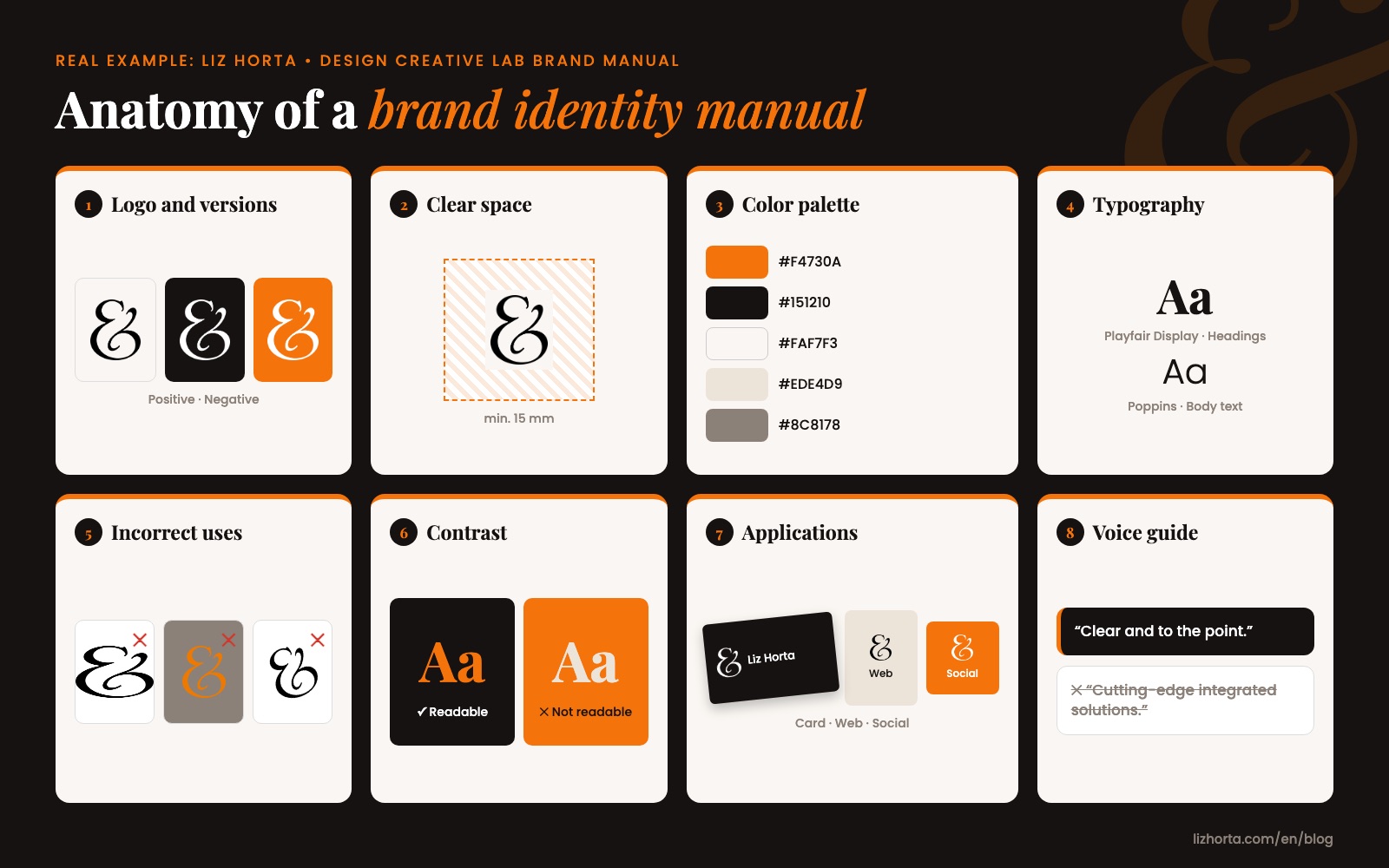
- Logo and its versions. The primary logo, horizontal and vertical layouts, the symbol on its own, and positive and negative versions (for light and dark backgrounds).
- Clear space and minimum size. How much free space the logo needs around it and how small it can be printed without getting lost.
- Color palette. Every color with its print codes (CMYK and Pantone) and screen codes (RGB and HEX). Ideally measured from the original logo, not estimated by eye.
- Typography. Which typefaces are used for headings and which for body text, with their weights and sizes.
- Incorrect uses. Examples of what not to do: stretching the logo, changing its colors, placing it on backgrounds without enough contrast.
- Contrast and legibility. Which color combinations read well and which do not, especially for text. This also takes care of accessibility.
- Applications. How your brand looks on stationery, email signatures, presentations, social media, uniforms, vehicles or trade show booths.
- Image style. Which kinds of photos and illustrations fit your brand and which do not.
Which famous brands have a great identity manual?
Three cases worth knowing, each for a different reason:
- Mexico 68. The identity of the 1968 Olympic Games, designed by Lance Wyman, is one of the most studied graphic systems in the world: logo, typography, pictograms and wayfinding following the same rules across the whole city. See the story of Lance Wyman and Mexico 68.
- NASA, 1975. Its graphics standards manual (the one behind the famous "worm" logo) defined how the brand should look on everything, from letterhead to the side of a rocket. See the reissue of the NASA manual.
- Mailchimp. Its voice and tone guide is public and a great example of the section most manuals still lack: how the brand writes. See Mailchimp's voice guide.
What is brand identity, and how is it different from branding?
Brand identity is the visible and written side of your brand: logo, colors, typefaces, imagery and tone. Branding is the whole work of shaping how people perceive you: it includes identity, but also your value proposition, your customer experience and what you deliver.
The identity manual is the tool that makes all that branding work look consistent at every touchpoint.
Should a brand manual include how the brand speaks?
Yes, and today more than ever. Beyond the visuals, a complete manual includes a voice guide: how your brand talks to its customers, which words it uses, which it avoids, and examples of well-written copy.
If your team already writes emails, posts or proposals with the help of artificial intelligence, that voice guide is what makes AI write like your brand and not like anyone else's. It is something I now include in every manual I design.
When does my company need a brand identity manual?
It is worth doing if any of these sound familiar:
- You work with several suppliers (printer, agency, designer, booth builder) and each one delivers something different.
- Your logo lives in a JPG and nobody has the original file.
- You are opening a new location, launching a product, exhibiting at a trade show or redesigning your website.
- Your team is growing and everyone makes their own presentations.
- You are registering your trademark and want what you register to match what you use.
How many pages does a brand identity manual have?
It depends on the size of the brand. For a small business or a professional brand, a clear manual runs from 10 to 30 pages. More pages do not make it better: what matters is that anyone can open it and know what to do without asking you.