
 Design Creative Lab
Color is the first thing people recognize about a brand, often before they read the name. That is why choosing it "because I like it" or "because it's trendy" gets expensive: a year later you no longer love it, every piece comes out in a slightly different shade and your brand doesn't stick in anyone's memory.
I have been designing brands since 1994, and here is the method I use with my clients, with my own palette as an example.
What is a brand color palette?
It is the set of official colors your brand uses everywhere: logo, social media, website, business cards, presentations and packaging. It is not a list of pretty colors, it is a system: each color has a role (lead, support, background, accent) and exact codes so it looks the same on screen and in print.
How do I choose colors for my brand?
Before you open any palette generator, answer three questions:
- How do you want your brand to feel? Warm, elegant, energetic, trustworthy. Pick two or three words.
- Who are you talking to? A law firm is not a bakery, and a bakery is not a school.
- What colors do your competitors use? If everyone in your industry uses blue, a different color helps people remember you.
The color comes from those answers, not the other way around. If your brand foundations are clear, the palette almost chooses itself. I explain them in What are the foundations of a personal brand?
What does color psychology say about branding?
Each color has common associations, but they are not fixed rules: they depend on culture, on the exact shade and on how you combine it.
- Red: energy, passion, urgency.
- Orange: creativity, warmth, enthusiasm.
- Yellow: optimism, joy, attention.
- Green: nature, health, growth.
- Blue: trust, seriousness, calm.
- Purple: creativity, luxury, spirituality.
- Black: elegance, authority, sophistication.
- White and neutrals: cleanliness, space, calm.
Use it as a starting point, not a recipe. What makes a color work is that it fits your personality and that you always use it the same way.
How many colors should a brand have?
A working palette has 3 to 5 colors:
- 1 primary color: the one people associate with you.
- 1 or 2 supporting colors: for backgrounds, sections and variations.
- 1 or 2 neutrals: whites, grays or sand tones so everything can breathe.
- 1 accent (optional): for buttons, calls to action or details.
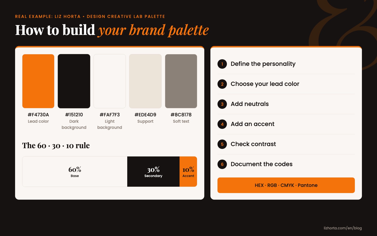
A very useful guide to combine them is the 60-30-10 rule: 60% of the space for a base color (usually a neutral), 30% for the secondary color and 10% for the accent. That way your brand color stands out without overwhelming.
How do I build my brand palette step by step?
- Define the personality in two or three words.
- Choose your lead color to match that personality and stand apart from competitors.
- Add one or two neutrals to go with it.
- Add an accent only if you need one.
- Check contrast: text must be readable on every background. A beautiful color nobody can read doesn't work.
- Test the palette on real pieces: a business card, a post, your website's homepage.
- Document the codes for each color in your brand manual.
My own palette, for example, has a lead orange (#F4730A), an ink black (#151210), an off-white (#FAF7F3), a sand (#EDE4D9) and a warm gray (#8C8178). The orange says creativity and warmth; the black adds the seriousness I need when working with companies.
Which color codes do I need (HEX, RGB, CMYK and Pantone)?
Each color in your palette needs its codes for every use:
- HEX: for web and social media (for example, #F4730A).
- RGB: for screens and presentations.
- CMYK: for commercial printing.
- Pantone: when you need the exact shade on special prints, textiles or signage.
Without these codes, every supplier guesses the shade and your brand ends up with five different oranges. All of this goes into your brand manual; I explain what else it includes in What should a brand identity manual include?
Which famous brands are examples of a great color palette?
- Tiffany & Co. Its blue is so much its own that Pantone produces it as a private custom color, number 1837, the year the jeweler was founded. Read about Tiffany Blue
- Coca-Cola. Red and white for more than a century. You see a can from across the room and know the brand without reading it. Read about Coca-Cola
- IKEA. Blue and yellow on the logo, the stores, the bags and the uniforms: the same palette at every touchpoint. Read about IKEA
What they have in common is not the color they chose, but that they always use it the same way.
When should I change my brand colors?
When your brand has changed audience or level, when your colors get confused with a competitor's, or when they don't read well on screen. If you're just tired of seeing them, wait: your clients are only starting to recognize them.