
 Design Creative Lab
Most of us call any brand mark a "logo", but in design there are four types and each one works differently. Knowing which one you have (or which one suits you) helps you brief your designer well and makes your brand look complete everywhere.
I have been designing brands since 1994, and this is how I explain it to my clients, with examples you will surely recognize.
What is a wordmark?
It is a mark made only of letters: the name written with its own typeface and style. It has no symbol.
It works very well when the name is short, easy to read and you want people to remember it exactly as it is. Its challenge is that in very small spaces (an app icon, a profile picture) a long name gets lost.
What is a symbol or logomark?
It is the symbol alone, without text. It can be a shape, a letter or an icon that, over time, people recognize without needing to read the name.
It is the hardest one to achieve: a symbol works on its own only when the brand is already very well known, or when it always appears with the name at first. That is why most brands start with a combination mark.
What is a combination mark?
It is a symbol + text that can be separated. The symbol sits next to the name (beside it, above or below), but each can be used on its own.
It is the most versatile format and the one I recommend for most companies and personal brands: the full set goes on your website, stationery or trade show booth, and the symbol alone goes on social media, your favicon or a stamp.
What is an emblem?
It is symbol and text fused into a single piece: the name sits inside the symbol and they cannot be separated without the brand losing its meaning.
It looks great on seals, badges, labels and packaging. Its limit is that at small sizes the text inside becomes hard to read, so it is wise to also have a simplified version.
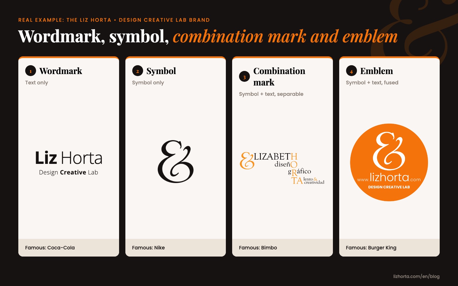
What is the difference between a wordmark, symbol, combination mark and emblem?
The quickest way to see it:
- Wordmark: text only.
- Symbol: symbol only.
- Combination mark: symbol + text, separable.
- Emblem: symbol + text, fused.
Which famous brands use each type?
- Wordmark: Coca-Cola. Its name in flowing script is one of the most recognized marks in the world, and it needs no symbol. See the Coca-Cola logo story.
- Symbol: Nike. The "swoosh", designed in 1971 by Carolyn Davidson, is recognized today without the name. See the story of the swoosh.
- Combination mark: Bimbo. The bear and the name appear together, but the bear also works alone on packaging and advertising. See the story of Grupo Bimbo.
- Emblem: Burger King. Its name sits between the two halves of a bun: separate them and it is no longer the brand. See the story of Burger King.
Which type of logo is right for my company?
It depends on how and where your brand will be used:
- If your name is short and easy to remember, a wordmark may be enough.
- If you will be on social media, apps or small products, you need a symbol, so a combination mark suits you.
- If your brand lives on packaging, labels or seals, an emblem can work very well, with a simplified version for small sizes.
- If you are already very well known, you can start using your symbol on its own.
Ideally your brand has several versions and your identity manual says which one to use in each case. I explain it in What should a brand identity manual include?